Icons as Wayfinding
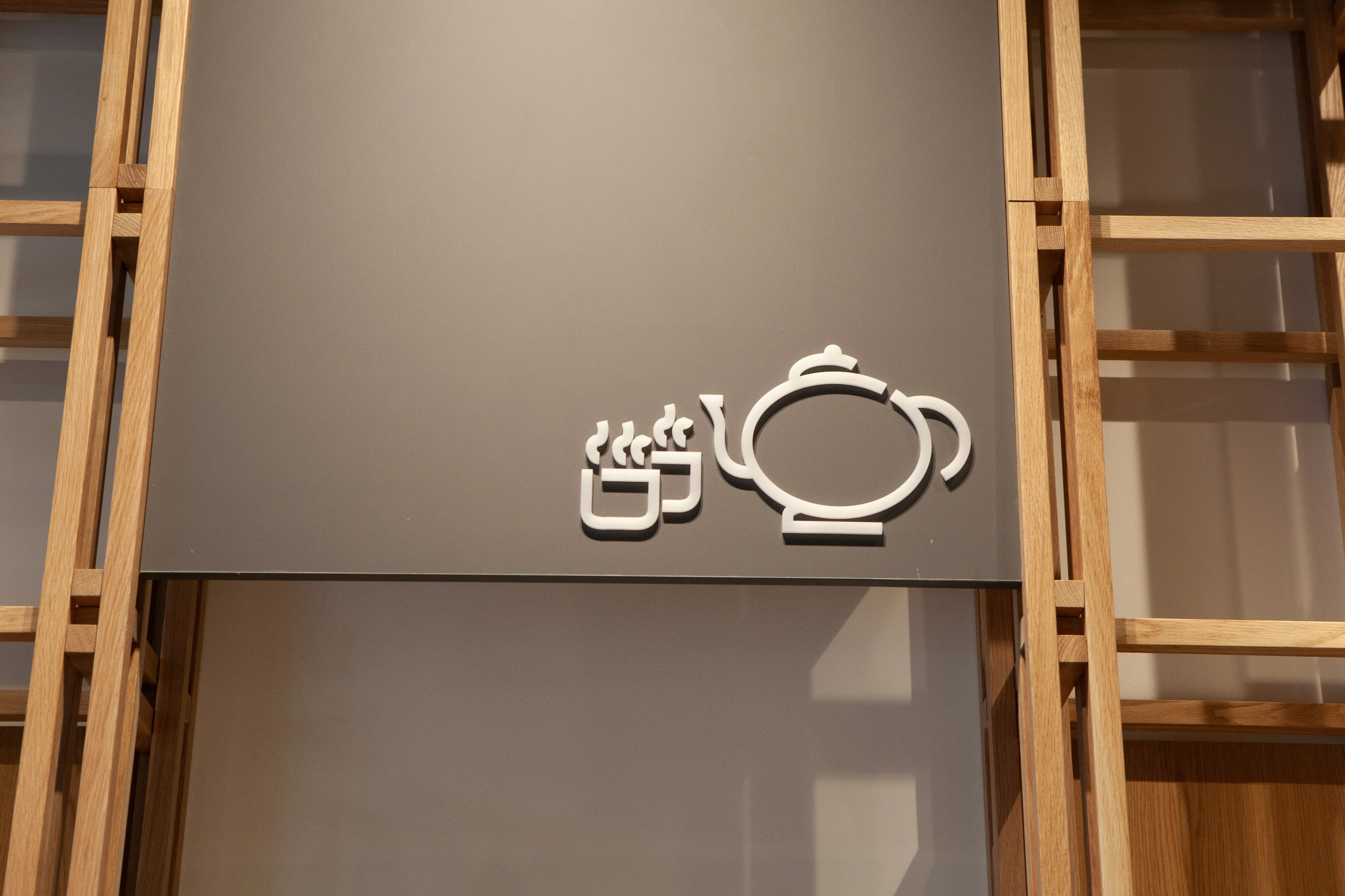
Over fifty original icons for a Japanese-themed retail store in one of Auckland's busiest malls. Wayfinding that feels like part of the brand, not bolted onto it.
- Client
- Japanese-themed retail store (via Context Architects)
- Year
- 2023
- Role
- Designer
- Deliverables
- 50+ original icons · Signage system · Brand-aligned wayfinding
The brief
A Japanese-themed retail store opening in a high-traffic Auckland mall wanted to do more than be “another two-dollar shop.” They needed iconography that worked as wayfinding and as brand atmosphere. Clear enough to navigate by, distinctive enough to remember.
The work
I designed over 50 icons for the store’s wayfinding system. Each icon was drawn to feel rooted in Japanese visual sensibility (bold strokes, balanced compositions, restrained detail) while staying functionally clear at signage size. Together they make the act of navigation feel like part of the experience, not a substitute for the brand.
Outcome
The store reads as a curated destination rather than a quick stop. Customers find what they’re looking for; staff don’t spend their days pointing.
Skills & tools
Iconography, traditional + digital illustration, wayfinding strategy, Adobe Illustrator.